Technology & Libraries, Tools of the Trade

Visualizing Library Circulation Trends Using Tableau Public

What is Tableau Public?   ​

Tableau Public is a free service that lets anyone publish interactive data visualizations to the web.

Who is Tableau Public for? ​

Tableau Public is for anyone interested in understanding data and sharing those findings as data visualizations with the world. Journalists, writers, bloggers, students, professors, hobbyists, critics, citizens and more.  As soon as a workbook is published to Tableau Public, the viz is accessible by anyone on the internet (with some restrictions – see below), so be sure to only use data that is suitable for a public audience.​

Sourcehttps://community.tableau.com/docs/DOC-9135

Pros
  • Excellent way to share data with library management, decision makers, and the Board of Trustees
  • Gives the data more meaning
  • Easier to spot trends
Cons
  • Exporting data from multiple sources is still time consuming
  • Normalizing the data also takes time
  • Learning curve

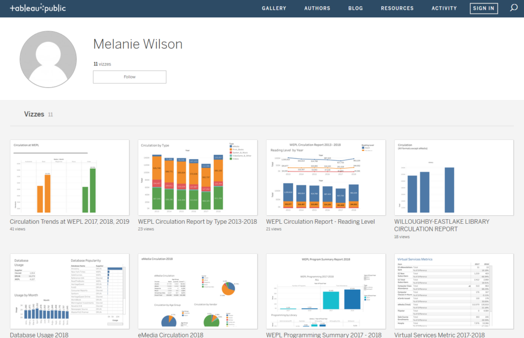
Vizzes are published on a public profile available on the Tableau Public website:

Vizzes in Tableau Public

https://public.tableau.com/profile/melanie.wilson3405#!/​

Before using Tableau Public, you’ll want to export and normalize the data you are interested in analyzing. Below are some tips:

  • What data are you going to want to analyze?  
    • Are you interested in seeing differences or trends based on branch, month, year, item type?
  • Will you want to filter by physical vs. digital?
    • Make these considerations before exporting your data as it may influence the data you export. 

Normalize the data and column headers

Format/ Item Type 

  • For example: eBooks & eBook  Tip: Use Find and Replace so that the same term is used across of all your sheets

Column headers

  • For example: # of transactions & checkouts. Use the same terminology for all column headers across your sheets

Think about what columns you’d manually like to add to your dataset

    • Platform
    • Collection Type
    • Media (Larger categories for grouping items)
      • Audiobook
      • Book
      • Magazines
      • Music
      • Video

A brief overview of how to use Tableau Public to create visualizations based on circulation data from multiple sources

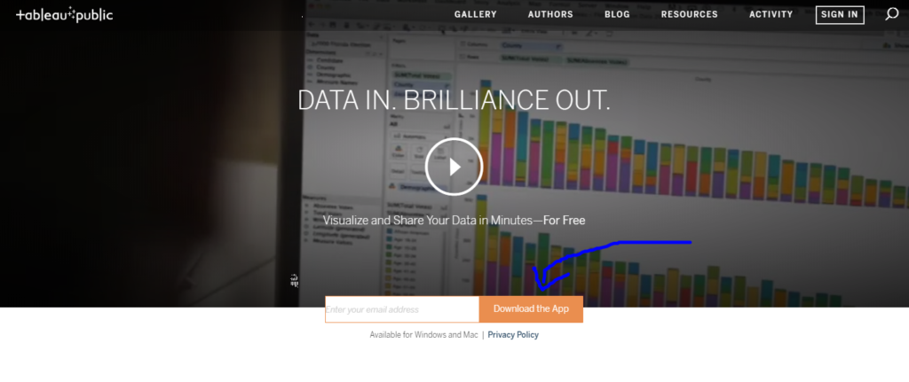
1) Go to  https://public.tableau.com.  Type your email address to download the app.

Tableau Public website with download link

2)      Open Tableau Public.  Click Connect -> Microsoft Excel. Navigate to where the Excel worksheet is saved on your computer.
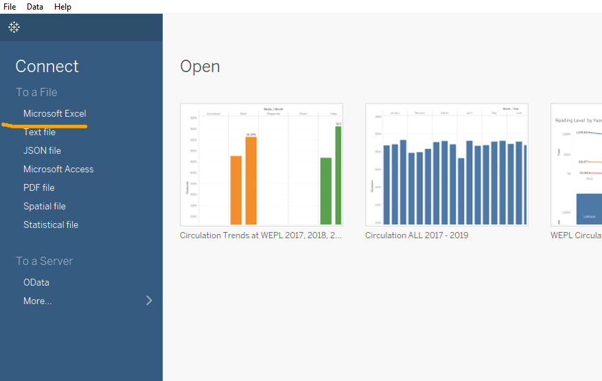
Connect data in Tableau

3)      On the Data Source tab, drag New Union to the white area.  Then drag all of the Sheets into the Union specific box. Click OK.
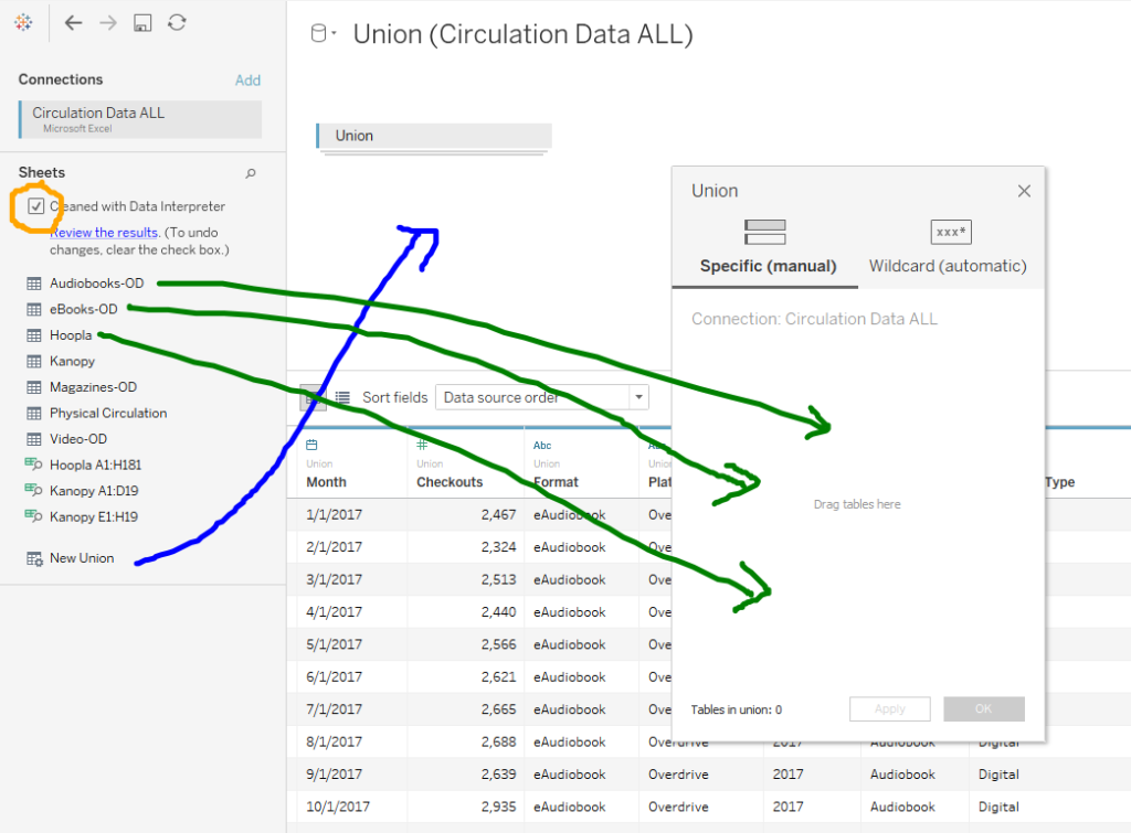
4)      Make sure your data types are correct.  Month = date.  Checkouts = number.

Data Types

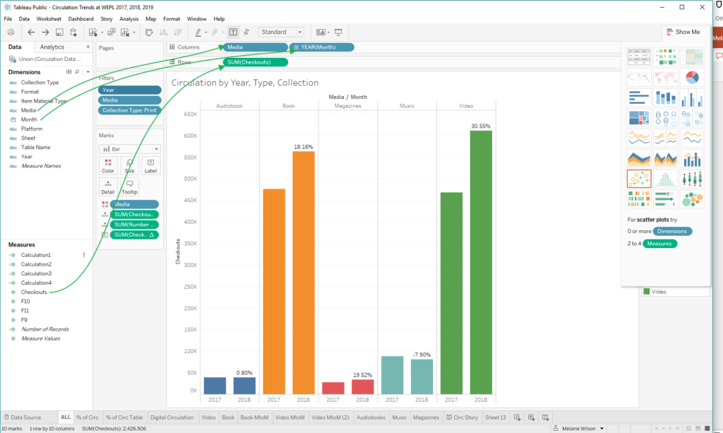
4)  On Sheet 1, build your visualization by dragging and dropping the Dimensions & Measures to the Columns & Rows.
5) Filters will help users interact with your data.  To add a filter, move the Dimension you’d like to filter to the Filters card.  In order to display the filter in your Viz, right-click on the Dimension in the Filter box and select “Show Filter”.
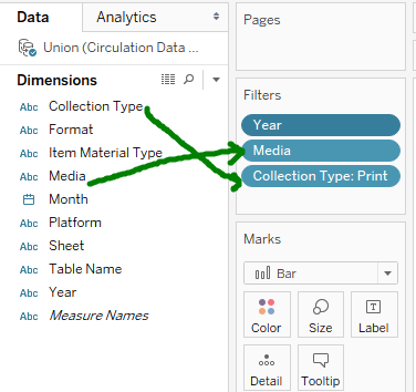
Adding Filters

Showing Filters

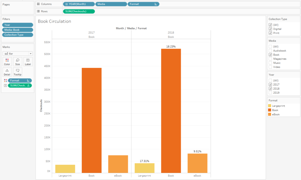
6) Changing the color of Dimensions will help users differentiate the data.  The Marks card will allow you to customize how data is displayed. In the example below, to change the color of the Format in the side by side bar chart, drag and drop the Format dimension to the Marks card.  Left-click the Marks property icon next to Format and select the Color property.
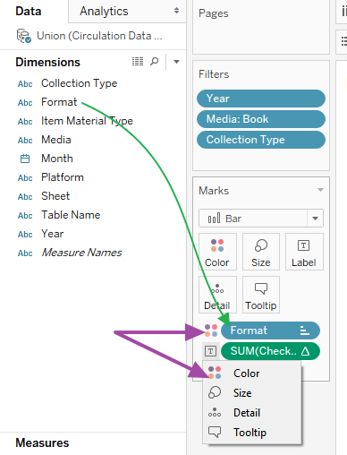
Changing Properties on the Marks Card 

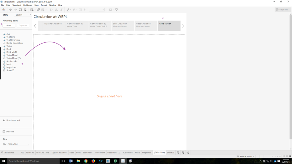
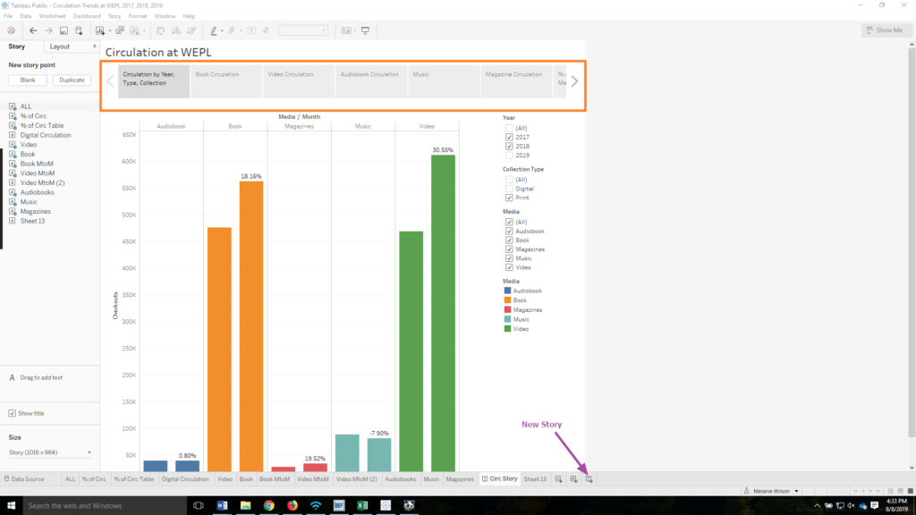
7) Dashboards and stories allow you to bring your data together in a more meaningful, easier to share display. Dashboards allow you to combine data from multiple sheets into a single visualization. Stories allow you to combine data from multiple sheets into a storybook format that users can easily click through.
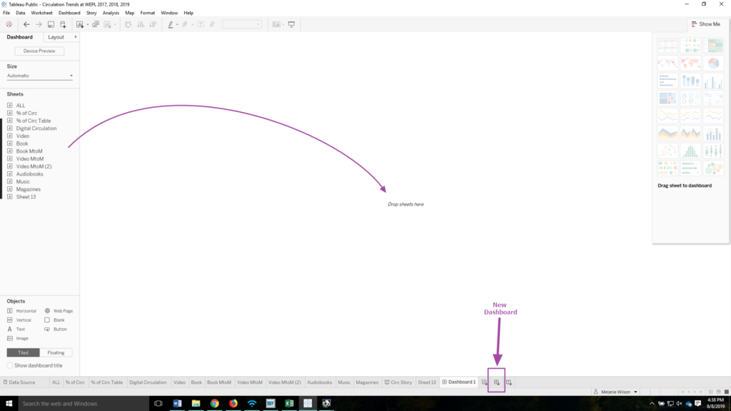
Creating a Dashboard
Creating a Dashboard in Tableau
Stories in Tableau
New Story icon and navigation bar in Tableau
Creating a Story
Creating a Story in Tableau

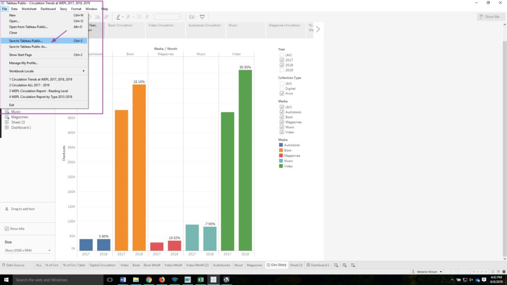
8) When you are comfortable with the Viz that you have created, navigate to File in the menu and click Save to Tableau Public…  . If you would like to share the story or dashboard view, make sure that is open on your screen before you click Save. If you aren’t already signed in, you will be prompted to log in to your Tableau Public account.  As soon as you hit save, your Viz will be published in your Tableau profile for the world to see.  You can make further changes to your document.  Every time you click save the changes are reflected on the Tableau Public website.
9) Once your Viz is published to the Tableau Public website, it is easy to share the Viz via Link available by clicking on the Share icon.
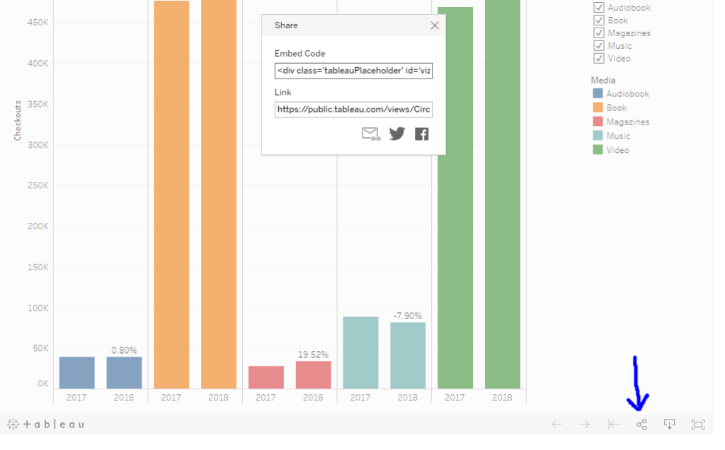
Share Viz in Tableau

Further Resources

Technology & Libraries, Tools of the Trade

Conditional Formatting in Excel

Across all of my professional positions, I have used Microsoft Excel extensively.  Over the years I have learned some tips and tricks and have become an “accidental expert”.  While working at Overdrive, Excel was the primary software that I utilized to normalize data submitted from publishers for upload to the database. At the library, I teach a beginner and intermediate level Excel class.  It is one of the most popular computer classes that the library offers. I’ll demonstrate some of my Excel skills below. 

Using Conditional Formatting in Excel

What is conditional formatting and why would you want to use it? 

The conditional formatting tool is available on the Home tab in Excel.  

Conditional formatting icon

Conditional formatting will highlight cells if they meet certain criteria – this can include identifying duplicate data, locating specific text, and discovering numbers that are above or below a certain range.  It is useful in spotting trends. Once the cells are highlighted, it is then possible to sort or filter the data in the worksheet based on the newly applied formatting.  

I’ll walk us through a very simple application of conditional formatting.

Today I will be using a spreadsheet with a list of magazines from two different suppliers.  I do not want to order the same magazine twice so my main purpose for using conditional formatting in this exercise is to identify and filter out duplicates. 

Click here to download the exercise sample file.

  1. Open the exercise file in Excel.
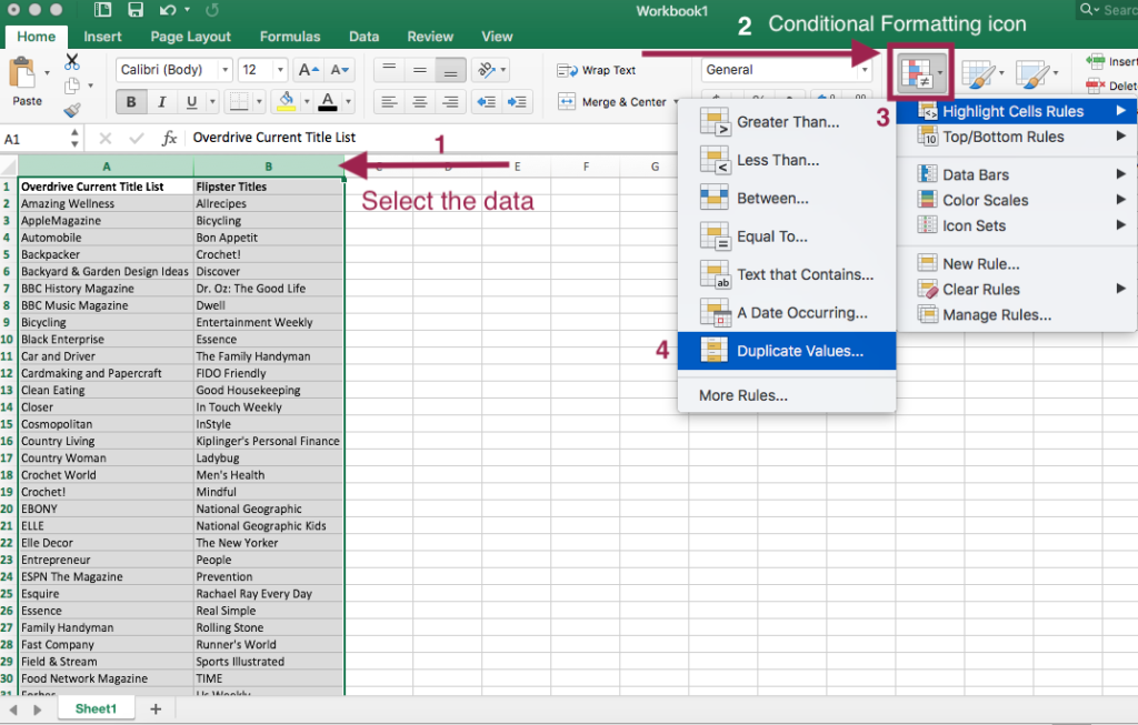
  2. In the exercise file, select the data is columns A & B as this is the data we want to compare. Once the data is selected it will be greyed out with a green border.  From the Home tab, click on the Conditional Formatting icon.Setting Up Conditional Formatting in Excel
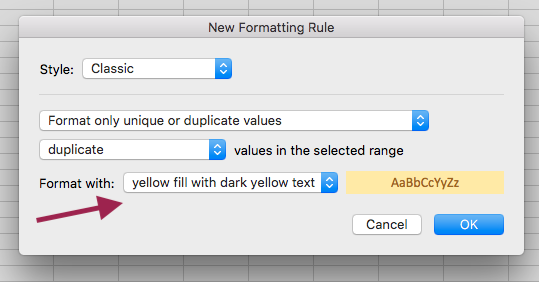
  3. From the conditional formatting menu, select “Highlight Cells Rules”. From the next menu that pops up, select “Duplicate Values…”. A grey box with a number of drop down options will appear.  You can leave all of the drop down options as is. I opted to change the “Format With …” option to “yellow fill with dark yellow text”. Conditional Formatting options
  4. Click the OK button. The duplicate data will now be highlighted in yellow fill as that was the formatting I selected.  If nothing is highlighted, then the condition has not been met and no duplicate data is present.
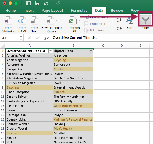
  5. Based on this new formatting, I would now like to filter out the duplicate titles. With the columns still selected and greyed out, select Data from the Menu.  Then click on Filter. Drop down arrows should now appear on your column headers.Filtering in Excel based on cell color
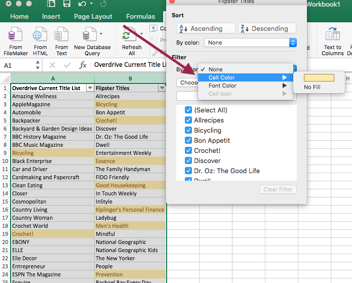
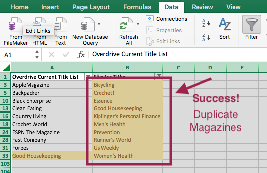
  6. On Column B, select the drop down arrow. In the pop up box, under Filter in the “By color:” field select the “Cell Color.” option. Then click the yellow box. In column B, only the cells highlighted in yellow should now be displaying.  I have now identified the duplicate titles. These are the titles I need to remove from this supplier’s order.Filter by Cell ColorFiltered Data


We can now remove the filter and conditional formatting rules from our worksheet. 

  1. First let’s remove the filter. Click the Filter icon from the ribbon menu.  The filter should now be removed.
  2. Click the “Home” tab to navigate back to the Home ribbon menu. Then click on the “Conditional Formatting” icon.
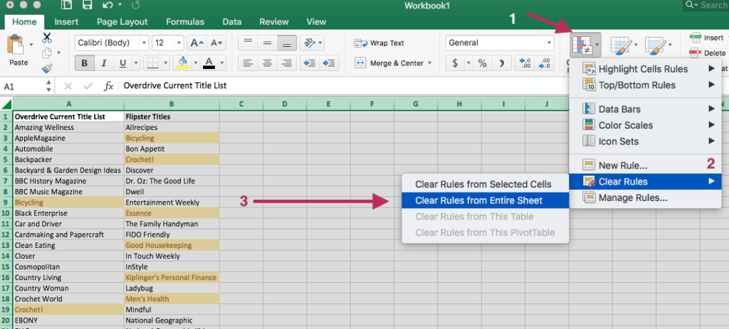
  3. Click “Clear Rules”. Then select “Clear Rules from Entire Sheet”.Clear conditional formatting rules
  4. All set!  The worksheet should now be returned to its original formatting. 

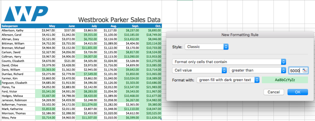
As noted earlier, conditional formatting can also be used to visualize trends.  In the example below, a condition is set to highlight cells in green that have a value greater than 5,000.

Sales trends with conditional formatting

With the cells now being color coded, we can see the September and October were strong sales months.

Technology & Libraries, Tools of the Trade

Canva is my Friend

My work at the library involves creating a lot of promotional materials for upcoming events. These marketing materials tend to be for display on our website, Facebook, & promotional TVs within our libraries. When I first started at the library I wrestled with Photoshop to make these graphics. Using Photoshop was time-consuming for the goal I was trying to accomplish. Photoshop is a great product but isn’t always the best choice.

I learned about Canva.com at an Emerging Tech workshop at NEO. I have used it ever since. Creating graphics in Canva is now part of my daily workflow. It is easy to create professional looking graphics in Canva. It is especially easy to include these images on social media sites & in email marketing.

Benefits of Canva:

  • Free!
  • Web based
  • Pre-made layouts & text
  • Great font options
  • Free graphics & icons
  • Downloadable files

Cons: There is no easy way to copy and paste between different files. Formatting is lost when copying text to a new file.

Canva.com is a great addition to any library’s marketing toolbox. It is also useful for small businesses looking for free marketing tools.